A few weeks ago we introduced SmurfPowder™, a system that assigns players to team based on rankings derived via TrueSkill. The goal of this system is to pick balanced teams so that games will be challenging for all. Specifically, we wanted to address the issue where our previous (random) assignment system would sometimes produce hugely unbalanced teams, resulting in one team steamrolling the other.
gsan and I spent several days building, testing & deploying SmurfPowder™ and it is running well but how do we know if it's actually improving things?
We need a way to identify bad games so that we can see if the proportion of bad games decreases over time.
From experience, a couple of examples would be:
- Blu failing to capture point A on Badwater, or failing stage 1 on Goldrush
- Blu literally steamrolling Red on Badwater or Frontier by pushing the cart from start to finish without pause
We could try to write down every bad game scenario but this is tedious, error prone, and limited by our imagination and personal experience.
We have the logs from every round played since Smurfy Fortress began so we decided to do some log crunching and use visual tools to help us identify features that define bad games. A link to the raw data is provided at the end of this post.
Initial Exploration
Although we had some ideas of the sorts of features we were looking for we weren't entirely sure so I went looking for a visual tool that would make experimentation quick & easy. I had heard good things about Tableau so downloaded a trial.
Tableau makes it very easy to visualise data. You simply drag & drop dimensions and measures, and with a few clicks you can try out different charts to see what patterns emerge.
The two examples listed earlier led us to consider Round Duration and Kill Difference as possibly significant features of bad games. The intuition is that unusually short durations probably indicate a Blu steamroll. For longer durations it's not clear whether one team was overly dominant so for longer durations we need to take into account other metrics such as the Kill Difference.
Initially we plotted Average Round Duration vs Time, and Average Kill Difference vs Time but these graphs were uninspiring and rightfully so. Both Round Duration and Kill Difference vary greatly by map so averaging across all maps produces a meaningless statistic. Fortunately Tableau makes it easy to dissect data by any dimension so we were quickly able to replot the same data by map/stage, as well as experiment with varying time windows (i.e month, week, day etc).
Let's start with Round Duration. Clickity, click, here we have Round Duration vs Winner for Payload maps summarised by week.
Note: I recommend opening these graphs in a new tab as we will provide some commentary below so you'll want to be able to flick between this post and the related graph.
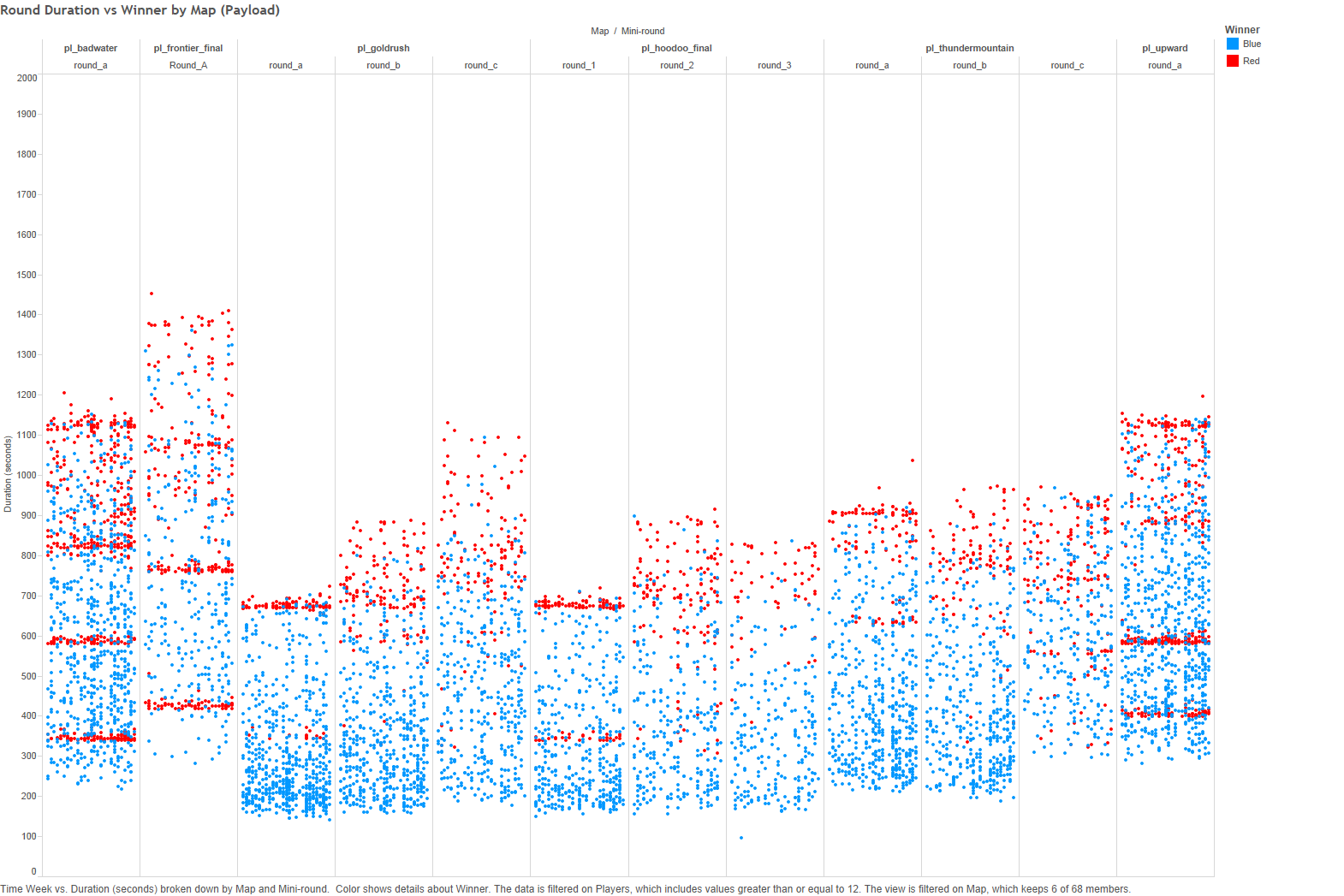
Across the graph we have partitioned the data by map, and stage where applicable. Within each map/stage each vertical set of points represents one week of matches. Vertically we have the Round Duration, and the colour of each point indicates the Winner of that particular round.
Immediately we can see some patterns. For example in Badwater and Frontier (first two columns) we can see horizontal red lines that correlate with Red wins (successful defence) at each capture point.
We can also see that on Goldrush the density of the Blu dots (Blu wins) in the lower region indicates that Blu often wins stage 1 and 2 very quickly but stage 3 is more challenging. Regular Hoodoo players may be amused by the stray Blu win at the 100 second mark – that's the runaway bomb bug.
This graph confirms some of our intuition but without futher information we can't tell whether games were balanced. Short duration Blu wins on Payload may indicate a steamroll but with so many short duration Blu wins on Goldrush were they all bad games?
Let's look at the same games but plot Kill Difference vs Winner for Payload maps.
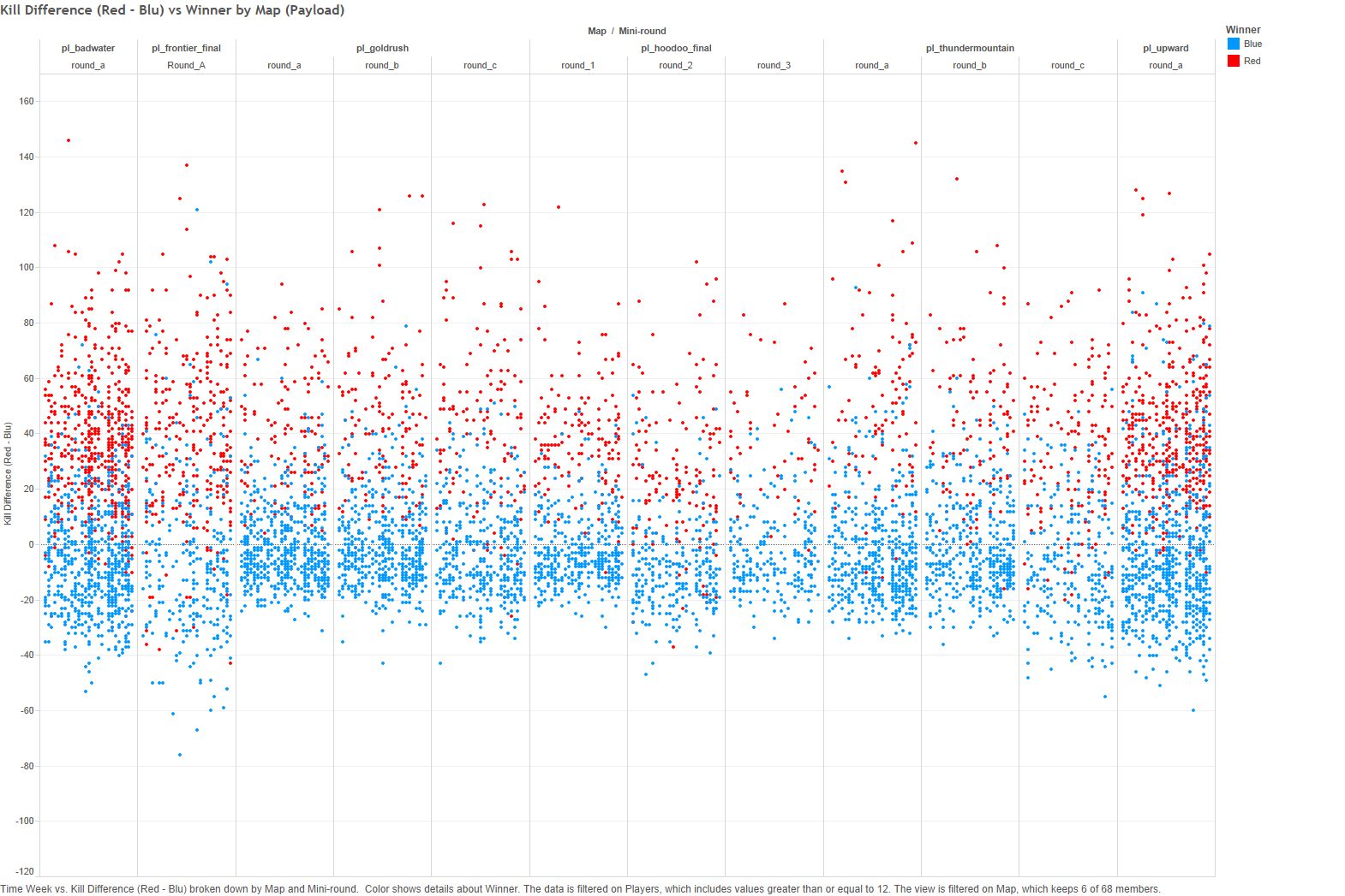
Note that in this graph the vertical axis is Red Kills - Blu Kills so negative values indicate that Blu had more kills than Red.
Intuitively we would expect that Blu wins would correlate with Blu having more kills and Red wins correlate with Red having more kills and this is mostly the case but not always. We can see several cases on Frontier where Red wins despite having less kills, and many cases where Blu wins despite having less kills. Overall it seems that for Payload maps Red needs to out deathmatch Blu in order to win.
What's interesting about this graph to me is the vertical spread. Intuitively we would expect close games to have relatively small Kill Differences whereas we may surmise that the Badwater round with a near 150 Red kill advantage was probably very one sided. Perhaps we could draw a line at Kill Difference of 100 and say that all games above this point were one-sided? Similarly we might say Blu wins with Kill Difference below -30 may have been one-sided.
It becomes painfully obvious at this point that neither of these graphs provides quite enough information to decide which games might be bad but there are definite patterns in the data. Before we go on to plotting Round Duration vs Kill Difference by map let's quickly look at the above plots for other map types.
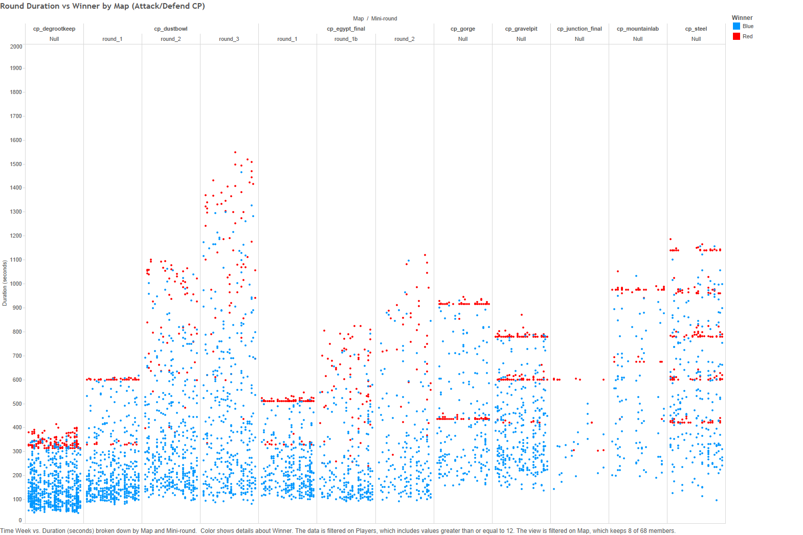
Round Duration vs Winner for Attack/Defend CP maps
Kill Difference vs Winner for Attack/Defend CP maps
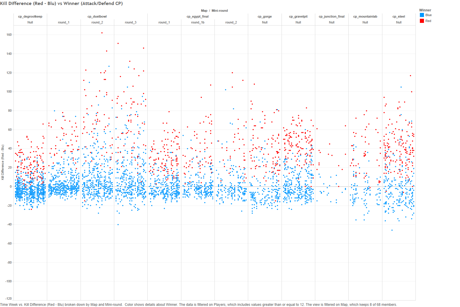
These are very similar to their Payload counterparts which makes sense given that both share the format of one team attacking, one team defending.
For the symmetrical maps we get very different patterns:
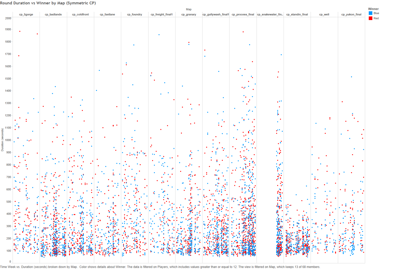
Round Duration vs Winner for Symmetric CP maps
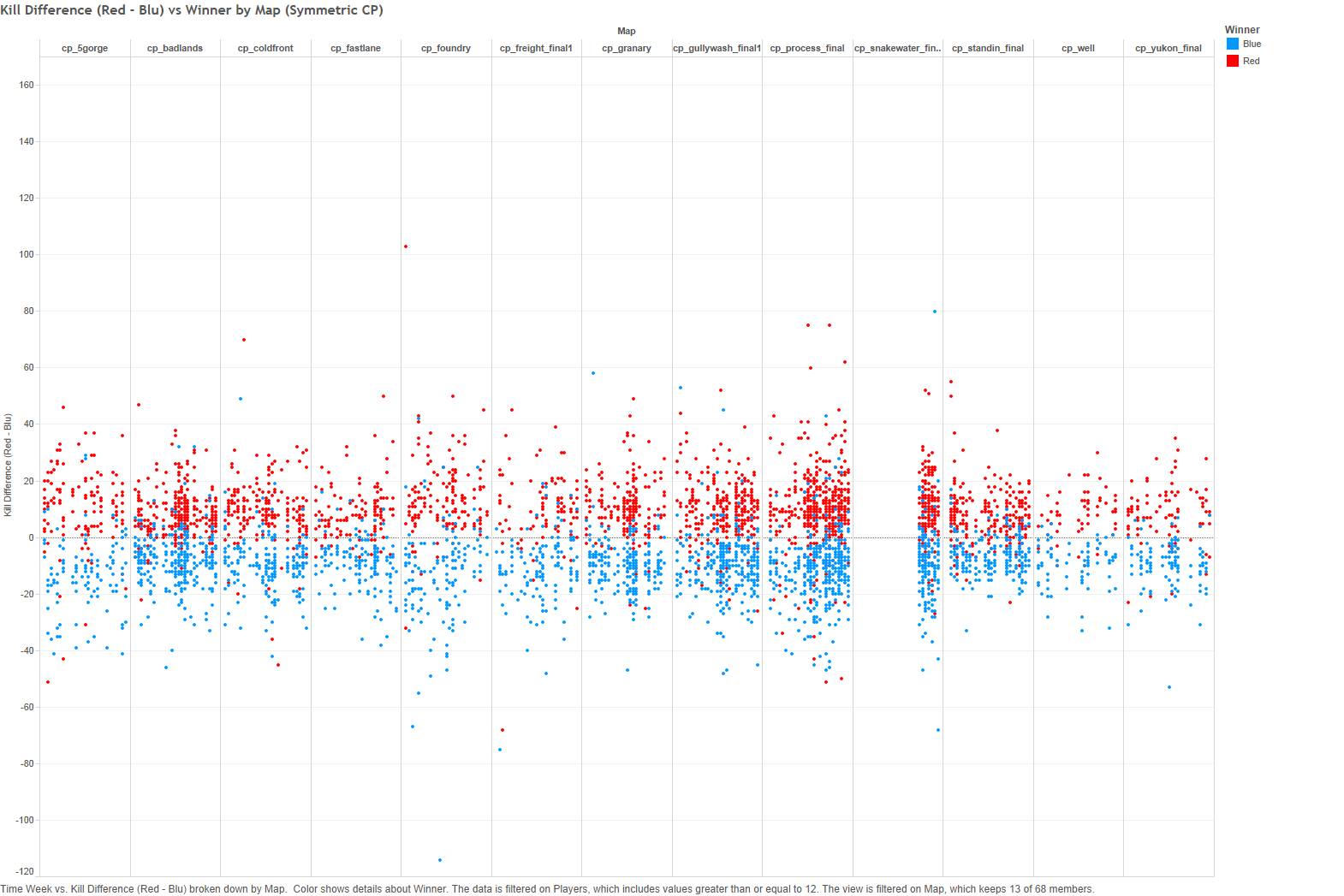
Kill Difference vs Winner for Symmetric CP maps
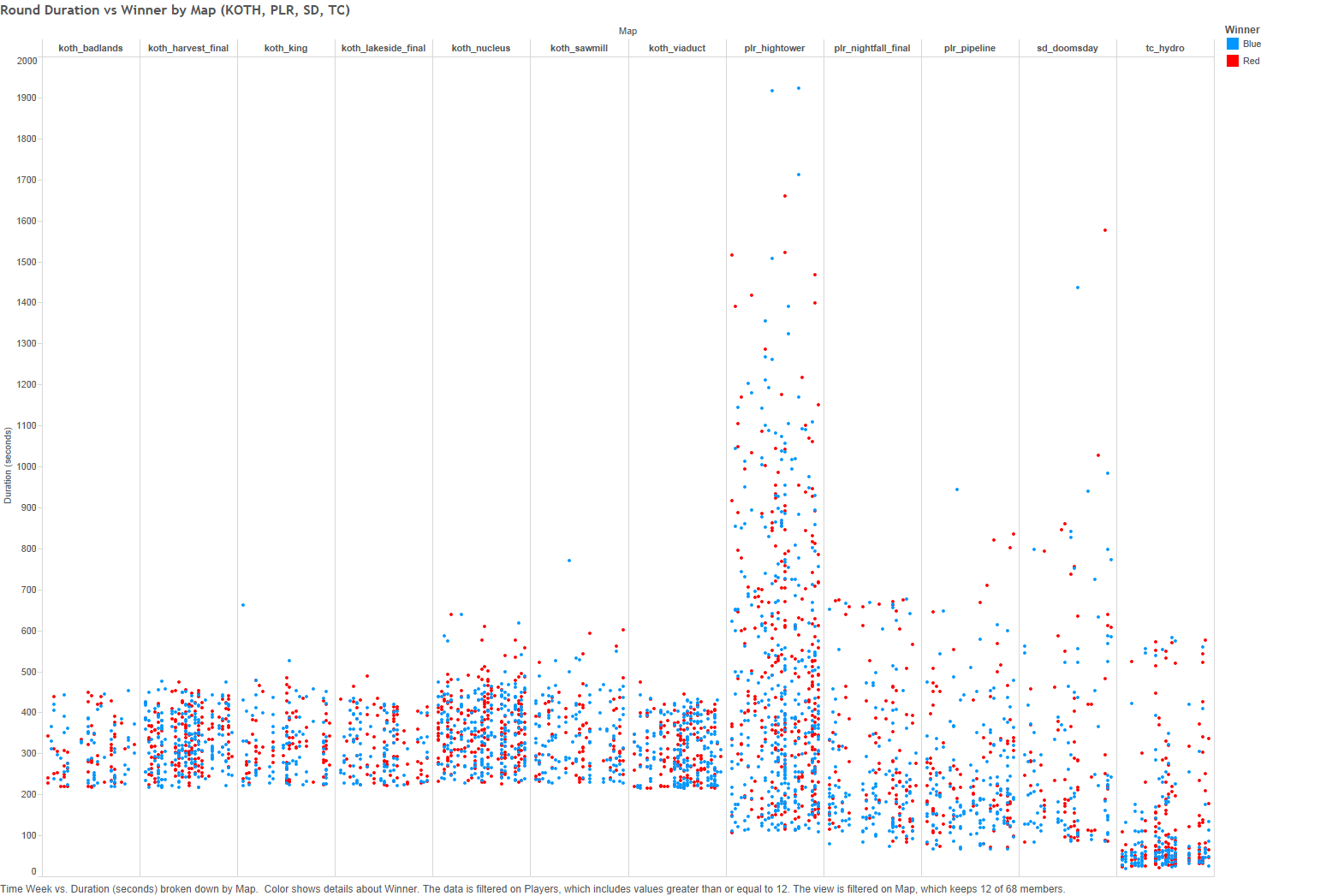
Round Duration vs Winner for KOTH, PLR, SD & TC maps
Kill Difference vs Winner for KOTH, PLR, SD & TC maps
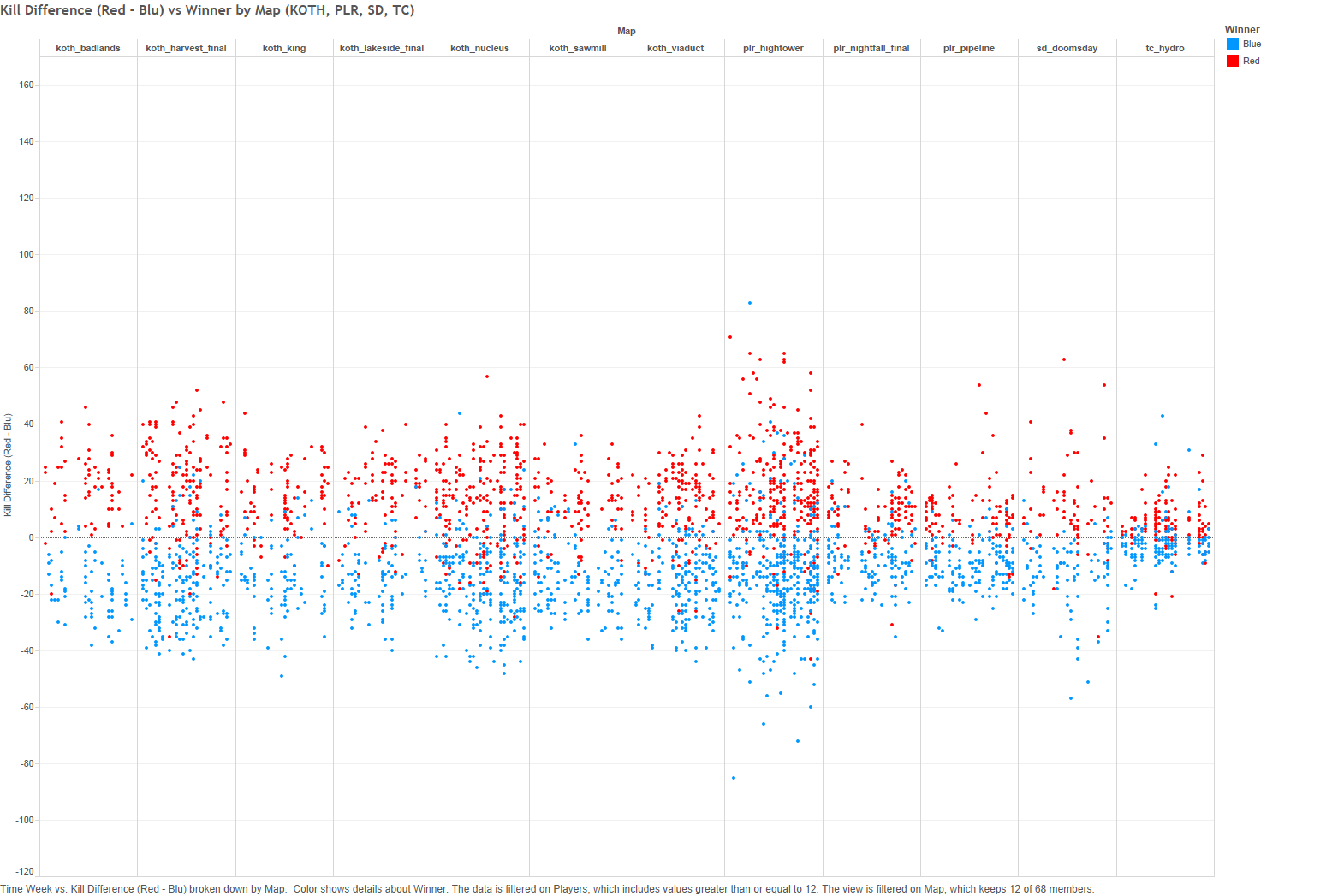
As one would probably expect given that the maps are symmetric and the team objectives are also symmetric the plots also look fairly symmetric. SYMMETRY ALL THE THINGS! Blu & Red win in roughly the same durations, and with roughly the same kill differences.
It may be worth noting the spread of round durations for symmetric CP maps, as well as the crazy durations of Hightower vs the other Payload Race maps. I guess people really like Market Gardening.
There's many observations that could be made, comparing maps & game modes but this blog post is already insanely long. :) Please feel free to leave any observations in the comments below!
Map by map breakdown
We then dug into the data map by map, round by round and plot Round Duration vs Kill Difference. We jumped out of Tableau for this part. Tableau is fantastic but I can't afford the $999 license fee and we need metrics that we can monitor over time in order to evaluate SmurfPowder™'s effectiveness.
gsan wrote some Python code to generate plots as we felt by this point that we had a reasonable basis for long term metrics. I'll highlight a couple of examples but the full set is linked at the end of this post.
Note that in this series of graphs we switched from Kill Difference (Red - Blu) to Winning Team Kill Difference. I apologise for this inconsistency but we opted to use the former to highlight symmetry in the earlier graphs but the latter makes more sense when we look at Round Duration vs Kill Difference.
Let's take a look at Badwater, being one of the most popular TF2 maps.
Round Duration vs Winning Team Kill Difference for Badwater

Each point represents the winner of the round as before. The solid blue line and solid red lines mark regions which capture our intuitions regarding features of bad games. The larger dots indicate the games we have classified as bad, based on the aforementioned intuitions as well as other heuristics.
We suppose that, given sufficient game rounds, for particular maps/stages some percentile of the kill difference and duration are bad games. For simplicity, we assume that for all maps, all kill differences greater than 95 percentile and all durations less than 20th percentile are bad rounds. We classify the intersection of these as bad rounds. However, it should be noted that there is correlation between kill difference and round duration.
Furthermore, we also consider those rounds in Attack/Defend maps where Red is able to hold the first half of all capture points as bad games.
For Badwater the Blu line captures 2 intuitions. Firstly, short duration games are almost certainly bad – capturing 4 points in under 400 seconds means the cart barely stops, if at all. The second is that as the game goes on (duration increases) we would expect the kill difference to increase but we can see that across all games the kill difference rarely exceeds 50. The Red line captures the intuition that winning at CPs 1 and 2 at any duration is probably okay as long as the kill difference is not large. Red wins at CPs 3 and 4 with larger kill differences than at CPs 1 and 2 may also be okay since the game has gone on longer.
Exactly where the boundaries should lie is debatable but for our purposes precision matters more than recall so we try to be conservative in that respect. We also expect that we will adjust the boundaries as we further study the data and gain additional insights.
As another example let's look at Goldrush stage 3.
Round Duration vs Winning Team Kill Difference for Goldrush stage 3

Unlike Badwater this graph captures a single stage (stage 3) of Goldrush. Like Badwater, our intuitions here are that Blu steamrolled Red if they won the round super quickly, or if the kill difference is large. If Red wins with a large kill difference then it's likely the game was one sided but we use a graduated Duration:Kill Difference ratio to allow for larger kill differences in longer games.
These are just two examples and the graphs for each map/round look very different so I encourage you to poke around at the full set.
Toward a single evaluation metric
To figure out if SmurfPowder™ is effective in reducing the number of bad rounds we aggregate all of the above into a single metric: percentage of bad rounds over time.
Smurfy percentage of bad rounds

The green shaded area indicates when SmurfPowder™ was active and as yet we do not have enough data to know if it has improved things but we can at least see that it hasn't made things noticeably worse. That's a good start.
What next?
We'll need to wait for SmurfPowder™ to accumulate game results and refine its rankings for individual players, and we'll continue to monitor our bad rounds metric over time.
In the meantime we'll continue to update & further analyse the data that we have and encourage you to do the same.
The raw data produced from log parsing is available here. There are two tab delimited files containing data summarised by server, date, map, and mini-round. Mini-rounds are stages of multi-stage maps such as Dustbowl and Goldrush. all.tsv contains all of the data for Smurfy Fortress beginning October 2012, and all_6month.tsv is the most recent 6 months, both ending 3rd January 2014.
The earlier Tableau graphs above were generated using the 6 month data set but the later Python generated graphs use the full Smurfy set. This was initially because I dun-goofed the processing and didn't want to wait 5 hours to generate the full set but it turns out to be more pleasant for the Tableau graphs as 14 months worth of data for each map would have been too visually dense (or require larger graphs).
The 6 month Tableau workbook is available at Tableau Public.
Please download and play with the data and let us know if you have any suggestions or feedback.
Also, we would love to analyse data from other TF2 communities! If you run TF2 servers and are willing to share your logs with us please get in touch (leave a comment below or email smurfy@mooh.org).